A Market for Secondhand Sparkle
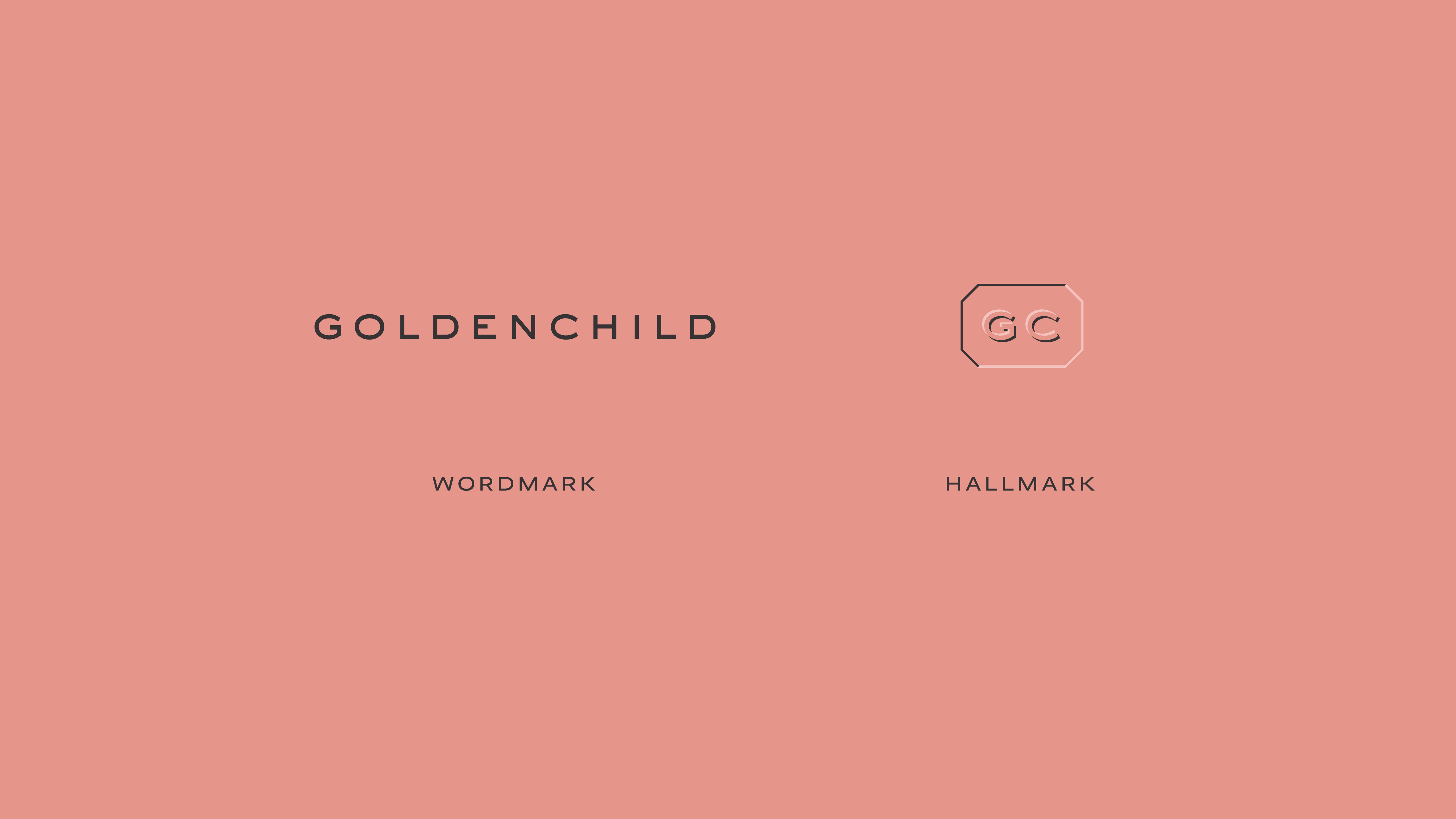
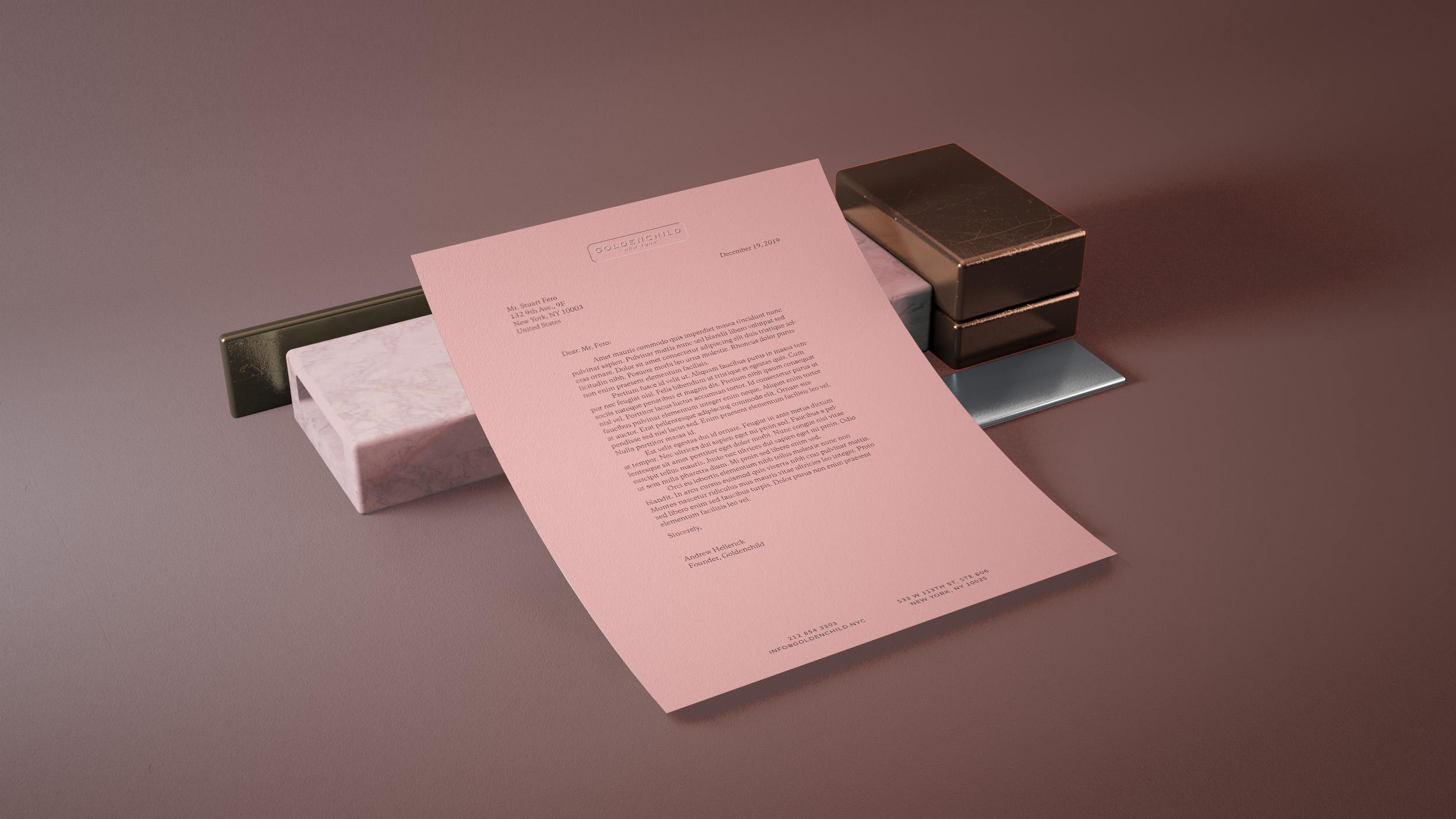
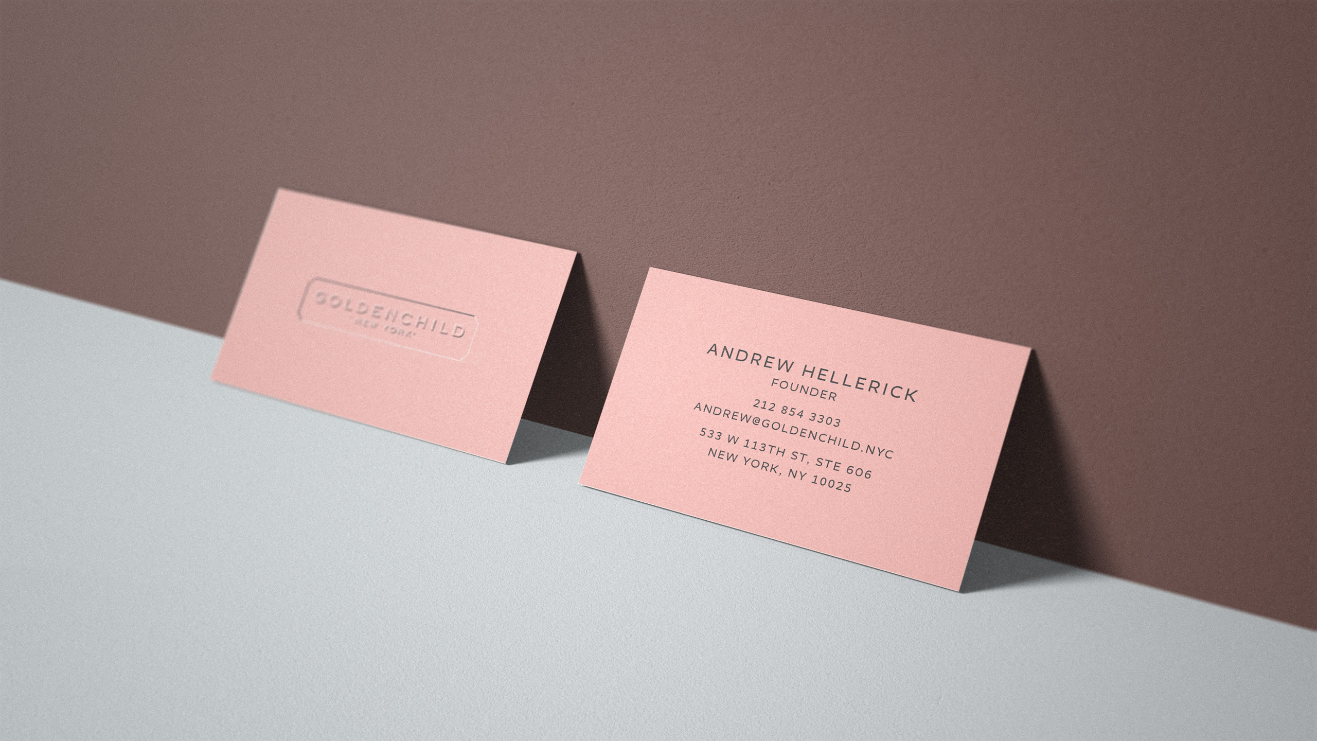
Goldenchild
Goldenchild is a passion project for its founder: he wanted to begin a business scouting out quality vintage accessories and accoutrement — mostly jewelry — from antique shops and fairs up and down the East Coast, curating that collection, and then selling his wares online.
Identity Design
Credits
Me

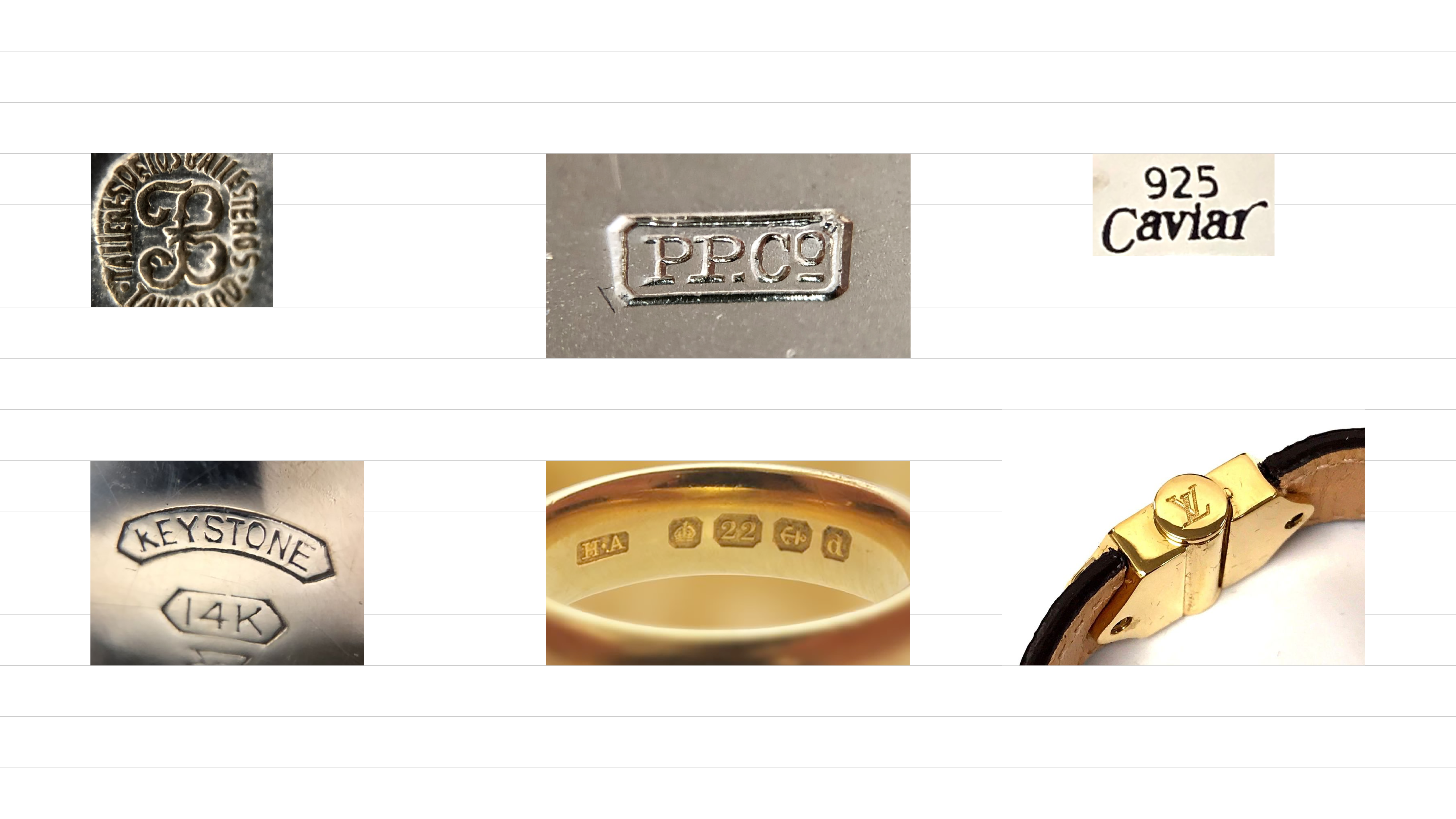
In my research for this project, I discovered the existence of "hallmarks" — marks struck onto metal items to to certify their composition and origin.
For some countries and their governments, hallmarks are extremely important and sanctioned ways of marking the legitimate sale of valuable metals.
In the same vein as printers marks, hallmarks are designed by crafters, jewelers, and metalurgists with the personality of the business behind them. Historically, hallmarks could be quite exquisitely designed — perhaps to reflect a time when gold and silver were the greatest symbols of luxury, status, and wealth.
Many hallmarks, perhaps because of how they are stamped into the metal, are framed by a hexagon or multi-sided polygonal shape. This shape — and some of the physics around engraving itself — became the inspiration for Goldenchild.
← Back to home page
© Kyle Schumacher-Picone, 2023.